Best practices, research-based recommendations, and concrete examples

When designing questionnaires, it’s easy to believe that the most important element is the questions themselves. It’s a natural assumption, but often wrong. The scales - the response formats we take for granted - are in fact some of the most critical components of the entire measurement process. A scale can strengthen or weaken validity, reliability, and the respondent experience, and a poor choice of scale can render even the best-formulated questions methodologically useless.
This article provides a comprehensive and research-based overview of how to choose and use scales correctly. We look at why scales often fail, how to avoid the most common pitfalls, how the number of response options affects measurement quality, why labels must be crystal clear, how to design for mobile - and why pilot tests are an absolutely essential quality safeguard.
In short: You’ll learn how good scales produce strong data and better decisions.
Tip: If you want to read about questionnaire design and best practices, I recommend the article: How to design an effective questionnaire.
One of the fundamental problems in survey research is that people do not share the same linguistic interpretations. Words like “a little,” “somewhat,” “very,” “good,” and “excellent” do not mean the same thing to everyone. Without precise definitions, each respondent creates their own mental construction of the scale’s intensity.
The result is a dataset where two people may choose the same value for completely different reasons. Variation in the data appears to reflect nuances in attitudes, but is actually caused by linguistic ambiguity. This is not informative variation — it is noise. And noise makes it harder to identify real patterns and reduce uncertainty.
We see the problem especially in midpoint categories. “Neutral” is perceived by some as slightly positive (“I have no complaints”), while others see it as a negative rejection (“I am not satisfied”). The same applies to positive terms that for some are minimal expressions and for others strong evaluations.
Krosnick and other cognitive survey researchers have documented how respondents use shortcuts - satisficing -when a scale is too long, illogical, or mentally demanding. The respondent stops thinking and chooses the first acceptable answer instead of the most accurate one.
This is often seen as an unnatural clustering of the midpoint or certain “comfort values” that are selected without real reflection. The more mental effort the scale requires, the more inaccurate the answers become. On mobile, the problem becomes dramatically worse because the visual structure of the scale affects clicking behavior.
One of the most serious - and invisible - errors occurs when the question and the scale do not measure the same psychological phenomenon. Even small differences in wording can shift the focus from a feeling (e.g., satisfaction) to an evaluation (e.g., quality).
A well-known example is asking about satisfaction using a scale like “Poor – OK – Good – Excellent.” Even though the question is about satisfaction, you are actually measuring the respondent’s perception of quality. The data looks normal and credible, but represents a different construct. Decisions based on such data are made on a faulty foundation.
Illogical scales create illogical results. This can appear as flat distributions, unexpected jumps in time series, strange averages, or response patterns that do not align with qualitative comments.
A scale consisting of “Good – OK – Super,” for example, can produce a higher average than a standard satisfaction scale, simply because all three labels fall within the positive spectrum. The results look impressive but do not tell the truth. The analyst ends up explaining a problem that does not lie within the organization, but within the scale design.
Poor scale design leads to poor strategic decisions. When data appears credible but is methodologically flawed, the problems are often discovered only at the end: in presentations, reporting, interpretation, budgeting, and prioritization.
You may end up believing an area is performing well even though employees are actually dissatisfied. You may believe customers are satisfied when they merely assessed product quality as “good.” You may believe wellbeing is stable even though the scale was simply confusing.
In short: Bad scales hide problems the organization needed to see.
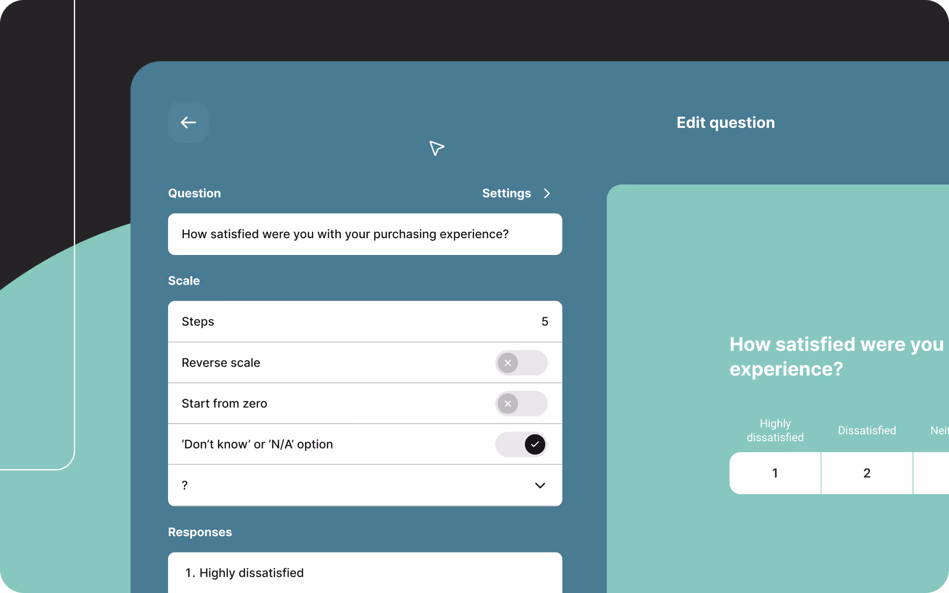
Choosing the number of scale points sounds simple, but has major methodological implications. According to Finstad, Preston & Colman, and Lozano et al., the number of points affects reliability, validity, and cognitive load.
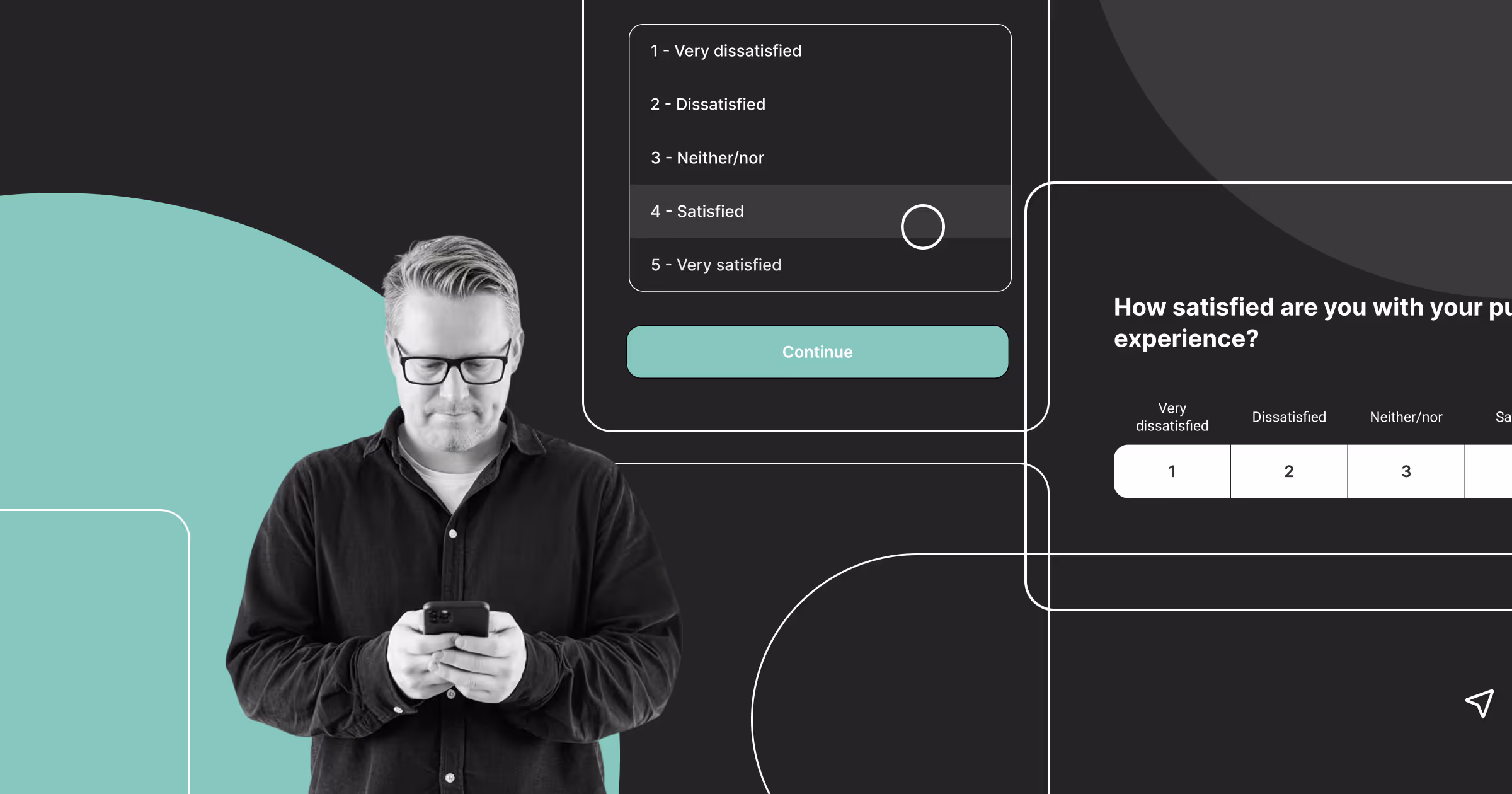
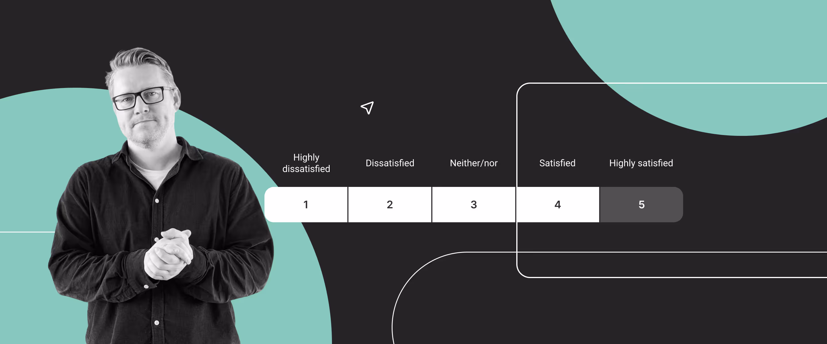
Five-point scales often provide the best balance between comprehensibility and precision. They are intuitive and work well for satisfaction and experience measurements.
Seven-point scales offer even finer nuance, especially in attitude measurements where gradations matter.
When you exceed seven points, reliability typically decreases because people struggle to distinguish between so many intensity levels.
When measuring agreement, a three-point scale is too coarse. It reduces complex attitudes to three categories and removes all intermediate steps. A person who is slightly agreeable and a person who is strongly agreeable are forced into the same category, inevitably masking real differences.
A seven-point scale provides much greater precision. Respondents can express weak, moderate, and strong levels of both agreement and disagreement. This makes it possible to detect early issues and follow small changes over time.
Labels are the heart of the scale. Respondents do not read numbers; they read words. Therefore, it is essential that the wording precisely represents the intensity you want to measure.
Research shows that fully labeled scales - where every point has a clear meaning -provide significantly higher reliability. Unclear labels create interpretive variation, and variation creates noise.
A clear example is the measurement of stress. A scale with “a little stressed,” “stressed,” and “very stressed” does not produce a stable measurement because the intensity is undefined. A five-level scale from “not at all stressed” to “extremely stressed,” on the other hand, mirrors the way people naturally assess intensity, and therefore delivers much stronger data.
Mobile devices are now the most commonly used platform for completing questionnaires. Therefore, scales must be designed with small screens as the primary context. Long scales, small click areas, wide matrix questions, and horizontal scrolling create frustration and errors.
A mobile-friendly scale presents one task at a time, has large click areas, keeps the number of points at a moderate level, and avoids visual distractions. When the scale is easy to use on mobile, satisficing decreases and data quality increases.
Pilot tests are one of the most effective ways to improve scales. Real users typically reveal errors that designers and researchers fail to notice because they are too close to their own formulations.
A pilot test can uncover illogical intensities, unclear labels, cognitively demanding scales, or mismatches between questions and scales. This insight makes it possible to fine-tune the scale before it reaches a large audience. It prevents time-consuming and costly analyses where one attempts to repair data that is already compromised.
Once a scale has been sent out, it cannot be changed without losing comparability. Therefore, pilot tests should be seen as a fundamental step, not an optional extra.
A scale is not a technical detail. It is the foundation of any measurement and determines whether your data becomes accurate, valid, and usable. A good scale reduces bias, increases reliability, improves the respondent experience, and provides the organization with a stronger basis for decision-making. A bad scale produces numbers that look credible but lead you in the wrong direction.
Professional scale design requires clear labels, an appropriate number of points, mobile-friendly layout, and pilot testing. When these elements are in place, the scale becomes a powerful measurement instrument - and your data becomes a reliable source of insight.
Henrik Nielsen is Head of Research at Enalyzer and an external lecturer at Copenhagen Business School. He works with the development of advanced questionnaires, methodological design, and the implementation of analysis projects across industries.
Henrik has extensive experience in survey methodology, data modeling, and the operationalization of measurements in large organizations. He advises both Danish and international companies on creating valid measurements, ensuring methodological consistency, and converting complex datasets into decision-relevant insights.
We'll match you with the right expert.